User Experience and User Interface guidelines
This is intended as a reference document for developers working on the BlenderBim addon.
Operators
BIM will by definition contain a (big) number of submodules or subschemas. Granting access to the features of these submodules to the users needs to be considered with several things in minds :
Ease of use : How do I achieve my goal with the minimal number of clicks ? How many different menu items do I have to go through to get to my goal ? How long do I have to scroll a menu to get to the specific thing I have in mind ?
Clarity : How long do I have to visually parse the interface to find the item or button I’m looking for ? Are the buttons correctly labeled and are the icons descriptive enough ? If something is forbidden, can I easily know why ? Can I know what a button does before clicking on it ?
Completeness : I need to have access to all the items that are related to the topic I’m interested in. If it is tied to another submodule, I need to have access to it.
Blender
These considerations must be adapted to the Python API, to the general paradigm we have chosen to access, modify or create IFC data, and to the general philosophy of Blender. There are many ways and places where an add-on creator can choose to present information to the user. BlenderBim currently works that way :
Information about the current context is displayed inside the properties editor. We leverage the fact that it is already built around displaying different types of information whether we are in the Scene, Material, Mesh, Object, Curve, Texture, etc. subpanels. It fits really well with the way things are already organized in the IFC classification.
Tools to create, modify or delete items are in the dedicated Toolbar (The left one) in the 3D viewport
Some Misc tools and information are displayed in the N panel of the 3D viewport . They’re shortcuts to things that are already present elsewhere in the UI, but are handy to have when modifying objects or geometry in the Viewport.
Adding specific Import / Export IFC operators (arguably a bit misleading since BlenderBim does more than import / export in these operations)
Interface panels
The good : Every submodule is visually separated from each other. The user can customize its interface to only show what’s relevant to them at any one point by folding in or out panels. Development / Debugging is facilitated because each submodule’s interface is separated from the others.
The bad : Having many interface panels clutters the interface, leading to an overwhelming experience for newcomers especially.
Proposal : The addon should in the long run provide the user with dynamic UI depending on what’s their usecase. Preferably accessed in the Addon Preferences interface, with pre-made options that dynamically enable or disable specific parts of the UI. It should also provide the option to selectively add or remove specific parts of the UI on top of that. Additionally, when it does not make sense to display a specific panel, it should be hidden from the UI. (eg if an object has no IFC Class, it can’t be spatially contained, so the IFC Spatial Container panel should be hidden until the user sets the IFC class) In the long term it could also be interesting to think about some kind of tutorial mode where more information is conveyed through the interface for new users.
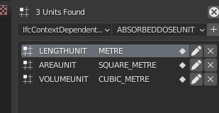
Item Lists
An item list should provide right off the bat a few features :
Add a new item.
Modify an item, whether by adding a button to each item in the list, or adding a button on the list header to modify the selected item.
Delete an item, whether by adding a button to each item in the list, or adding a button on the list header to delete the selected item.
Modify an item’s name by double-clicking on the field if applicable
The currently selected item should be highlighted
There should be a search field to filter through specific items in the list, with buttons to invert selection, sort alphabetically and revert display. (Features that are provided by the UIList class)
Operators
Some buttons should be dynamically disabled (grayed out and impossible to click on) when the context to execute them does not make sense. It is important to note there should not be any heavy computation to determine this since this is executed several times per second for each button where it is implemented. It should only test for simple things and not rely on retrieving information from other modules too much. eg : Is an item selected ? Is the z position of the selected object > 0 ? or Is the selected object an IfcOpeningElement ? and not Is there an IfcOpeningElement in the current file ? or How many different classes of IfcBeam are implemented in the file ? In Blender this is done in two ways :
Directly in the operator poll method which is executed when the button is displayed in the interface. The drawback is that some operators rely on custom attributes which are provided only when the user clicks on the button, and cannot be test in the poll method. Note in V3.0 we can implement custom messages when the poll method fails, depending on the step where the context was not right.
In the UI drawing code, where specific layout parts can be disabled.
Some buttons or entire interface layout rows or columns may be disabled or hidden at once. It may be desirable when it relies on specific things or combinations of things not being met in the project. In order to avoid UI flicker or the user wondering where the button went, dynamically hiding UI elements should have a minimal interference with the rest of the UI by :
Hiding the last row(s) of a panel
Dynamically resizing the rest of the UI when it’s not possible to (1)
The user should be advised why they are prevented to do things via either :
A custom message using Blender’s report system
A label in the UI replacing the missing UI elements
A helpful tooltip on an operator
Generally the context itself should be used to the best of its ability to convey why it’s possible to do some things or not. The separation of concerns in multiple different dynamically hidden-or-shown sub-panels should help limit confusion.
The user should be forbidden to click on buttons when its execution returns early and does nothing. If a button is clickable and the user clicks on it, there should always be some kind of feedback.
Icons

Icon name : “CANCEL”
Use : To disable the edition state of a particular item.
Expected result : A part of the interface showing the item attributes is either shrunk down or hidden. The button is usually replaced by a button to delete this item.

Icon name : “X”
Use : To delete a particular item, for instance an element of a list.
Expected result : The interface element referencing the deleted item is hidden from the interface. If the item was in a list, and the deleted element was selected, the next element becomes selected, or if there is no next element, no element is selected.

Icon name : “GREASEPENCIL”
Use : To Enable the edition of a particular item.
Behaviour : Usually only one element of a particular context can be edited at a time.
Expected result : The interface should either expand or spawn new elements to display the chosen item’s editable attributes. If the editem item is part of a list and its interface elements contained an operator to delete it, it is swapped for an operator to disable the edition of that item.
Proposal : Currently all the edition buttons are hidden from the interface when editing a particular item. This results on buttons jumping to the right slightly. My proposal is to instead show but disable the other buttons to prevent interface flicker.

Icon name : “ADD”
Use : To add an item to a particular context, either initializing it (eg. adding a coordinate system) or adding an element to a list.
Expected result : The interface should either expand to display the new item or a new line should be shown if the item is added in a list.
Proposal : In some instances adding an element in a list automatically enables the edition of this item’s attributes. (eg IFC Groups) but in other instances it does not (eg IFC strucural load cases). It is arguable but I do not think the user should expect a new item to be in editable state right off the bat when they add it to a list.

Icon name : “RESTRICT_SELECT_OFF”
Use : To select all the instances related to a particular item.
Expected result : All the objects relating to a particular item should be selected in the 3D viewport and/or in the outline.
Proposal : Whether or not previously selected objects should be deselected beforehand is up for debate I think, because both behaviours can be desirable. It also raises the question of which object should be set to active. (Random ? First one ? Biggest one ?…)

Icon name : “IMPORT”
Use : to import a particular file from the user’s computer’s directory to the current context
Expected result : A new file browser window should open, with sufficient information provided to the user to know which file type should be loaded in (eg adding a file extension, adding information in the filebrowser UI). When the file is loaded, the interface should expand to show the attributes or information or new context-sensitive operations provided by the imported file.
Proposal : Currently there are some instances where I don’t know if the elements are supposed to require an external file, eg


Icon name : “EXPORT”
Use : To export a particular file to the user’s computer’s directory
Expected result : A new file browser window should open, with sufficient information provided to the user to know which file type is going to be saved (eg adding a file extension, adding information in the filebrowser UI).
Proposal : When there is no actual file to be saved in the user’s directory or the filepath is already set in another place in the UI :

It may be better to use a save icon of some sort instead, eg


Icon name : “FILEBROWSER”
Use : To Provide the current context with the path to a particular file or folder
Expected result : A new file browser window should open, with sufficient information provided to the user to know which file type is required (eg adding a file extension, adding information in the filebrowser UI). Upon file or folder selection, this should populate a field in the current interface context with the path to the selected file or folder, or at least let the user know that the required information is now correctly filled in.

Icon name : “EYEDROPPER”
Use : To select a particular object in the interface to fill the field it is attached to
Expected result : The cursor should change to an eyedropper until the user clicks on the required item. The user should be made aware after selection if it was successful (associated field being filled) or unsuccessful (message ? or field staying empty)